24/03/2022

Spring clean your website

Have you started spring cleaning? The season is associated with starting fresh and cleaning out the old. We don’t think this should just apply to your home. 

Famously said before, your website promotes you 24/7, no employee will do that. So don’t neglect it! 

Wondering what to spring clean on your existing website? 

spray cleaning bottle

We’ve created a list of crucial areas to look at: 

  • Content 

Is the information up to date? Is it easily digestible? Make sure your content is in the right tone of voice, delivers valuable information and gets your message across in a simple way. 

  • Design

Trends change and not all designs can withstand the test of time. Design for a website incorporates the user experience as well as functionality, you want to ensure these are all up to date and suitable for your visitors. 

  • Functionality

Improving your website to include relevant or up to date functionality can really impact a user’s experience. Is there something new on the market your website should have or has your business changed direction and needs new functionality? 

  • User journey

Reevaluating and testing out your website’s user journey is a good place to start. In today’s world, people want immediacy. Fast loading pages, quick ways to get information and easy navigation. 

  • Links

When was the last time you checked all the links on your website worked? Are there links that go to a third party website? Is it still relevant or should that link be going elsewhere? 

  • CTAs

It’s key to have the right call-to-actions to convert visitors to customers. Throughout your website, you should have strategically placed CTAs which will direct your visitors. 

  • SEO

Is your website optimised for search engines? Ranking highly on search engines will do wonders for your website so why wouldn't you want to optimise your chances of that? Working alongside other sections, an SEO specialist will be able to put in place a plan to help your website gain authority. 

We hope our list has made you think about your current website and any parts which could be improved.

fingers using a touch pad for a computer

Need some expert help to spring clean your website? 

We’re a talented, friendly bunch helping all businesses from all industries with not only their website but their branding and marketing too. 

If you’re looking to up ate your website or start one from scratch, we can help from design to development to even a marketing launch campaign. 

We’d love to have a chat and let you know what we could do - please get in touch

09/02/2022

How to pick the right web design agency?

When you search on Google “web design agency”, you’re hit with millions of results. So, how do you decide which one is right for you and your business? 

The first question to ask yourself is, are you looking for a website re-design or are you looking for your website to be built from scratch. 

A website is a big project and requires attention to detail and effective management. It’s also not a cheap task in terms of cost and other resources. If you think it’s cheap and you’re being told it can be done very quickly, you should question it. 

Reviews of a web design agency are a great starting point but shouldn’t be the only way you decide on the right one.

web design agency exploring design ideas on a table

Other factors to consider when picking a web design agency: 

  • Experience

Learn and receive the best advice and service from an agency that has experience. Experience is how you find out what works, what doesn’t and what kind of service is needed. 

  • Industry

If a design agency is very tailored to one industry, that isn't yours, it could be difficult to deliver a service you expect. Understanding an industry and what they will need in regards to their website will help make the process more efficient. 

  • Conversions

Do they have a track record of converting visitors to customers? That’s ultimately what you want your website to do and what it should be designed to do. 

Find out their methods or if they offer an optimisation service for your website.

It’s a skill to be able to design a website that looks fantastic and is also optimised to convert visitors into customers.

Keep track of this by monitoring and tracking. If you’re unsure of how to do this, your web design agency should be able to talk you through it. 

  • Customers

Who have they previously designed a website for? Working together with a design agency that has similar values or a way of working is important in building a compatible working relationship. It will help ensure the process is as smooth as possible. 

Are you aware of longstanding client relationships with the web design agency? Any alterations, redesigns or upgrades will provide a great indication that they are a trustworthy agency to deal with. 

  • Other services

A good design agency should be able to offer a comprehensive service to their customers. Aside from design, look out for development and marketing services. 

22 group employees discussing web design with clients

Website design and build with 22Group

We are a Manchester-based digital agency covering all things website, branding and marketing. If you’re looking to have your website created, our team of experienced designers, developers and copywriters are ready to help. 

We’re proud to be a digital agency with vast experience, we have worked with different industries from finance to the healthy drinks industry. If you’re interested in our work, we have produced several case studies for clients we have worked with. 

Let us know if you have any questions or would like to have a chat about how we can help you - get in touch today. 

11/11/2021

Updating website content

We’re nearing the end of the year and as the classic saying goes “out with the old, in with the new”. Along with kicking bad habits, we want to remind you it's important to update your website content and keep it fresh.

When was the last time you updated the content on your website? Didn’t even realise it was something you should be doing? 

Website content includes everything from blogs to testimonials. It’s not just the content on your contact page or pricing page, the more obvious ones, that need updating. 

Updating website content isn’t something you should just do at the end of the year, it’s important to keep your content updated often. Not only for the practical reasons for a customer or user browsing your website but it also affects search engines.

You want to be doing everything you can to ensure you’re ranking well, right?

22 group employee writing down notes for updating website content

Benefits of updating website content: 

  • SEO

Search engines take note when you are regularly updating your website. They can tell if you’re consistently doing this and it all helps towards proving you are a valuable website; worth being shown in a search result. 

  • Engage your audience

Writing for search engines is an important factor when updating your website content but don’t forget to keep your audience engaged with it. Provide value to your customers and ensure the content is easily digestible and relevant.

  • Brand personality

Your website is the main platform to establish your brand personality, it’s where your customers can visit and refer back to 24/7. Keeping your content up to date will help portray this personality, especially if there has been a change in the business direction. 

  • Reputation for quality content

By frequently updating your website with quality, useful content you’re being viewed as a valuable source of information and will more likely be seen as a reputable website. 

  • Use it as a proof-reading session

Any mistakes spotted on your website whether that be spelling or spacing can cause a user to lose trust. If you frequently update your content you reduce this issue as you'll be checking on it.

We hope this has helped you understand why updating website content is seen as an important task and not something you only do every few years or at the end of the year. 

When you’re updating your content, it’s not just the text you should keep up to date on your website. Other areas to keep updated include the tech side and website design. 

22 group team having a meeting and discussing website content updates

22Group 

At 22Group we have a great team of copywriters who are experienced in writing website copy. Getting the tone of voice right and incorporating good SEO practices as well as bringing through your brand values is something we’re well versed in. 

Our fantastic team can help you with your branding, website and marketing. Whether you’re looking to refresh or start from scratch we’d love to have a chat. 

Find out more or ask us any questions - get in touch

17/09/2021

Time for a business autumn clean?

The start of September saw the introduction of autumn goods in the shops, children going back to school and people getting back into routines. And, with a change in season coming an autumn clean is just as important as a spring clean. But, we mean a business autumn clean.

Ensure your website, branding and marketing are all up to scratch and look the way you want it to. Keep content up to date, fresh and think about if these three aspects are still aligning with your business goals. 

desk with a computer, pot of pens and a mug

Website

Wondering if your website requires an update? Check if everything is still working, this could be the forms on your website, internal or external links or the customer login section. 

Once you’ve done that, is there now something you think could be added to your website to make it a better experience for your customers? A feature that allows them to do more or perhaps it’s something that has been suggested by your customers. 

Keep this in mind and not only will website updates improve the user experience but they will help with site security and your bounce rate. 

Branding

Right this moment, would you describe your branding as fresh? Does it fit in with the 21st century? 

From the colours used to the typeface, every aspect of your branding will influence how someone perceives your company.

Rebranding or a brand refresh can make you more relevant and can even help you reach and engage with a new audience. If you’re trying to tap into a new market or target audience, check if your branding is applicable to them as well as your current audience. 

Marketing

Are you following trends and managing to keep up with marketing tasks? 

Ensure your marketing goals still align with your overall business goals. It’s good to take a step back and look at the wider picture to see if you’re on track. 

Also, if you’ve been trying a marketing method for a while and it’s not getting you anywhere or getting you the leads you expected, take time to evaluate and try something different. 

When you update your marketing it will not only become more effective but it will also save you costs. It’s time to make wise marketing decisions. 

billboard with different colourful words

How can 22Group help? 

We’re proud to say we can offer many of your digital needs under one roof. Whether you are thinking about refreshing or creating a new website, brand or marketing we’ve got experts to help. 

Want to see what we’ve done before? Our latest case study is on a financial company who came to us for a website refresh, take a look at our work - click here

We’d be more than happy to have a chat about what you’re looking for or answer any questions you have - get in touch

11/08/2021

National Tell a Joke Day

National Tell a Joke Day is coming up on Monday, 16th of August, so we’ve searched far and wide to find the digital related jokes that made us laugh the most. 

Jokes about websites

  • Grandmothers are like websites
    • They keep telling you to accept their cookies
  • I was placed under arrest for downloading the whole Wikipedia website
    • I told the officer “Wait! I can explain everything!”
  • What is the most common job amongst spiders?
    • Web design
  • How do you comfort a JavaScript bug?
    • You console it

Jokes about branding

  • How do you deliver fonts? 
    • By Courier
  • Things aren’t always #000000 and #FFFFFF
  • Two fonts walk into a bar
    • The bartender says “we don’t serve your type here”. They called the Serif.
  • I’m very font of you because you are just my type.

Jokes about marketing

  • Why are SEO experts always late to work? 
    • They love traffic
  • Why did the marketer get fired as a tap dancer?
    • They wanted to get paid per click
  • Why was the SEO guru upset when she found out she was going to have twins? 
    • Duplicate content
  • I made a joke about organic reach on Facebook
    • … nobody got it
laughing crying emoji on an iphone

Ok, they might not of all had you laughing your socks off but we hope they put a smile on your face! 

Share the laughter and send on some of these jokes.

Great websites, branding and marketing are no joke to us. If you need help in creating or refreshing yours then get in touch with us today.

30/03/2021

10 myths about web design

We’re busting those myths about web design. Don't work in the web design industry? We get that coming from a different industry your perspective and understanding of web design probably doesn't go beyond the basics, that’s why we’re going to set these myths straight. 

1. The look of your website is the most important 

There’s no doubt that the look and appearance of your website are important, but it’s not the only aspect. Web design isn’t only graphics, imagery and visuals, it also incorporates designing the functional elements and content of your website.

2. I just need a collection of nice photos for imagery

Just gathering a bunch of images you think look great for your website isn’t the best strategy, a visual strategy will bring more benefits. Align it to your brand - if a picture speaks a thousand words then that’s what the visuals on your website need to be doing about your business. 

3. Social media buttons aren’t necessary 

Apart from the advantage of increasing followers on your social media channels, having the buttons on your website can improve your search engine rankings. Sharing content through your social buttons, like a blog, will give SEO a nudge in the right direction. 

4. The copy on my website isn’t that important

The copy on your website should portray your brand, having the right tone of voice and the right information. Don’t forget the length of your copy is key too, this affects the design and the overall look of your website.

5. I don’t need to update my website 

You’ve invested and spent good money on your website, why would you need to update it? Trends change and are ever-evolving so if you want your website to remain current then updates will be needed every so often. 

6. The more features I have on my website the better 

Thinking about your customers and solving all their problems through your website? Unfortunately, having lots of features can make the website complex, it’s best to map out the features you would like and be smart with them. 

7. The homepage is the most important

This is a common one, but we’re bursting that bubble because it’s not always true. Many customers end up visiting your website by landing straight on your product or service page - it’s what they’re usually searching for. 

8. It doesn’t matter if my website isn’t mobile-friendly

Thinking that most of the traffic coming to your website is through desktop is not only outdated but detrimental. The responsiveness of a website improves the user experience and actually counts towards Google indexing websites. 

9. The more content I have on my website the better 

Having lots of content can make your website hard to navigate. If you are struggling to keep the content succinct, a web designer will be able to provide a smart solution.

10. Once the website is live, I don’t need to touch it

It’s great when a website you’ve been waiting for is finished and finally goes live, however, it doesn’t mean you don’t have to touch it. Strengthen your website by conducting A/B tests, create landing pages, change your lead generating forms, keep your blog or news section up to date and don’t forget to keep your content current. This includes team members changing, product prices, services offered and more. 

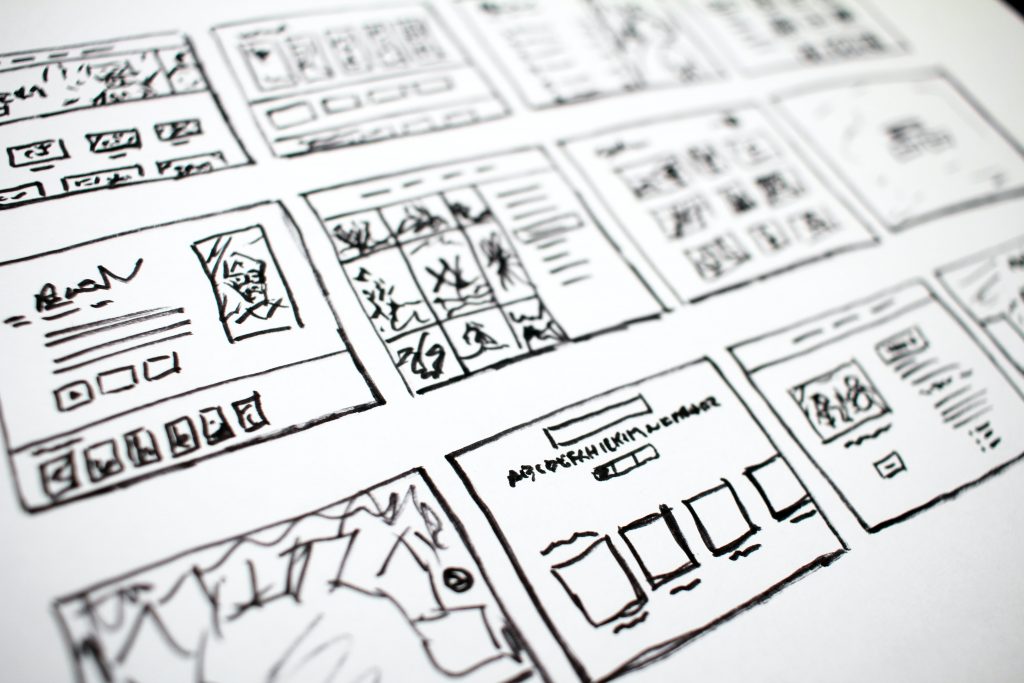
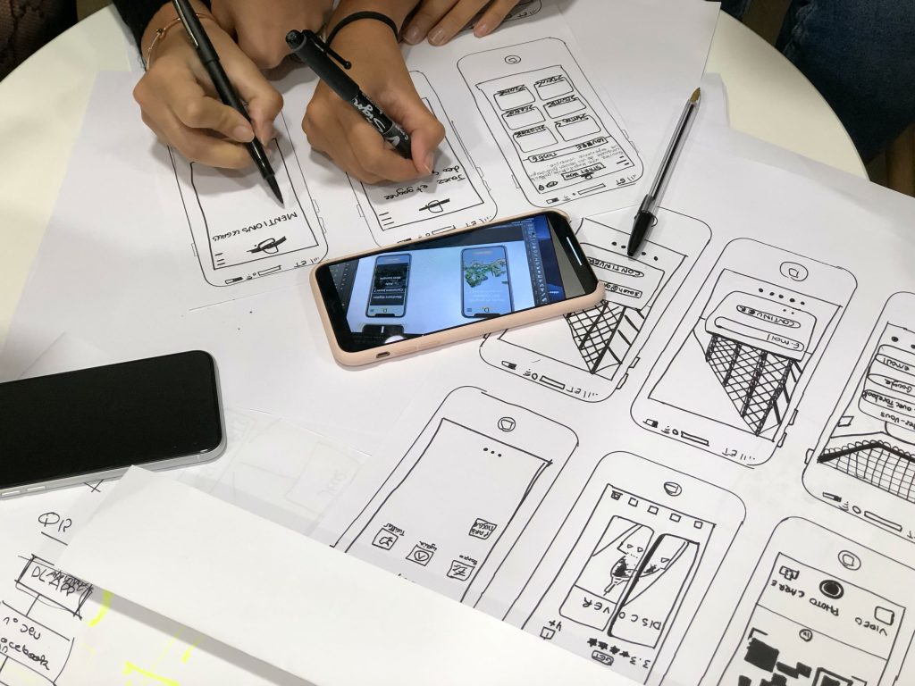
sketch of a web design plan - the sitemap

Did you think that any of these myths were true? Some may have been once upon a time but as time changes so do the web design ideas and best practices. Hopefully, we’ve cleared them up for you and even enlightened you too.

We’re a Manchester based web design company that also offers branding and marketing all under one roof. If you’re looking to update your website or have one designed, get in touch

03/02/2021

Do I need a business website?

Wondering if you need a business website? Did you start your own business during the pandemic? Or have a business but never got round to creating a website? 

The answer to your questions about needing a website for your business is a straight up: yes. Not just any website that you think will just do the job, a good one that’s been professionally designed and developed to drive your business forward, generate leads and future-proof your online profile.

Does it generate sales? Does it organically attract customers? Is it user friendly and intuitive?

You also want the website to make a splash and look great!

COVID-19 has ensured that every industry needs to be digitally capable. It’s more important than ever to have a website. 

three drawings of a website design layout plan in blue, purple and green watercolour

Reasons why you need a website: 

1. Improves credibility

Having a website to a lot of customers proves to them that your business is legit. A lot of consumers tend to look for a website when they are thinking of buying from you and check that what you are offering is actually authentic. 

2. It’s advertising 

It’s a no brainer that having a website is 24/7 advertising. No employee will do that for you! New customers may find your business online while they’re shopping around and may not have come across you otherwise. 

3. One stop shop 

Having a website means you can collate and have all your business information in one place, whether it’s information on all the services you provide or products you sell. This helps to focus your business objectives and makes it a better experience for customers to know what you have available and they can see everything in one place. 

4. Customer connection

Your website can allow customers to connect with you. This can be via a booking or reservation system where your customers come to make an appointment. Or simply if a customer is trying to get in contact they can fill out a form or get your business details in order to do this. We are form-obsessed at 22 Group and our clients’ websites include the latest and best forms to capture leads.

5. Sells itself

If your website is made well with a professional look, it’ll sell itself and attract customers that are browsing online. You want the website to be a valuable asset to your business and it should be a tool to help you stand out from the crowd.

6. You shouldn’t rely on social media 

With the social media platform algorithms constantly changing, it has meant that reaching and engaging with your audience or potential customers has been getting harder and harder. So many other businesses are on all the platforms as well which may mean less people are seeing your posts. It’s frustrating for businesses who are trying to build themselves.

22 group team sitting discussing building a new website and the website design for clients.

We’re a leading, award-winning company based in Manchester for website design, website build, branding and marketing. Since we are a Manchester website design agency it means we have an understanding of young, booming businesses to already accomplished organisations. Manchester has been recognised as the ‘entrepreneur capital’ (Business Live, 2020) and is known to be a digital and tech hot-spot.

Now is the time to get your website designed and developed. We know this is an important investment into your business and can accommodate websites to suit a range of budgets.

If you know the time is right for a website or a design refresh to your existing site, we’d love to hear from you and show you what we do.

Get in touch here or give us a call on 0161 672 7822.

02/12/2020

22 days of Christmas

Welcome to our digital A-Z jargon-buster as we count down the days to Christmas. 22 is our take on 25 in our Advent Calendar 2020.

Check in every day on our website or across our social media to learn a new word or refresh your vocabulary for websites, branding and marketing - in alphabetical order.

‘Tis the season to share, learn and be merry and we would love you get involved in our Advent Calendar so please share, like and comment!

If your business needs help in unravelling the constantly changing digital world, let us know. Our expert team can help to future-proof your online presence and make a splash through awesome websites, branding and marketing campaign.

We hope you enjoy following our #22daysofchristmas countdown.  

Let's start at the very beginning, a very good place to start.

A is for Algorithm: Complex programs used by search engines (e.g. Google) to find, rank and return the most relevant pages for search queries.

B is for Breadcrumb: A text path featured at the top of a web page showing where you are on a site. Thanks to Hansel & Gretel for helping us back home.

C is for Canonical tag: Way of telling search engines that a specific URL (Uniform Resource Locator) represents the master copy of a page. Prevents problems caused by duplicate content appearing on multiple URL’s.

D is for Domain: Name used to identify a website’s unique online space e.g. 22group.co.uk Domains are purchased and registered.

E is for Email marketing: Don’t just email your clients – capture, nurture, convert, retain. Do it right and it can be very powerful.

F is for Favicon: A tiny custom icon displayed to the left of your web address in your browser to help give brand or service identity. We have 22 in a circle. What’s yours?

G is for Goal: A measure of  how well your web site fulfils your target objective and represents a completed activity, called a conversion. Do you have your goals set up in Google Analytics?

H is for HTML: Hyper Text Mark-up Language, widely known as the language of the web. HTML are tags or commands informing the web-browser how to present a webpage.

 I is for Infographic: A graphical representation of data or information. A great way of creating and sharing interesting content in marketing campaigns and on social media.

J is for JavaScript: Scripting language used to create and control dynamic website content - anything that moves, changes or refreshes on your screen.

 K is for Keywords: Specific words or phrases which describe your content. It’s what your customers or potential customers would enter into a search engine.

L is for Landing Page: A specific website page which will show up when a particular link is clicked. Just like the one in our caption!

M is for Meta Description: The small amount of text which is seen on search engines before a site is clicked on. It gives a summary of the web page content.

N is for Newsfeed: Where updates from people or brands you follow are shown. Typically on social media, it will show profile changes, new photos uploaded, etc. 

O is for Organic Marketing: When your customers are coming to you naturally without using any paid advertisements to attract them.

P is for Plug-in: An add-on software which brings new functionality to a program or website. It allows customisation, enhancing its capabilities.

Q is for QR Code: A quick response (QR) code is a type of barcode that can be read by a smartphone. Once read, this leads you to a specific website or content page.

R is for Responsive Layout: This is when a website is able to adjust its screen size depending on the digital device that is accessing it.

S is for SEO: Search engine optimisation is the technique of improving your website and its content so that it appears higher in search engine rankings.

T is for Traffic: In relation to a website this refers to the amount of visitors, also known as “sessions”. This is a great way to measure online success. 

U is for UX: User experience (UX) refers to the overall experience of the user’s interaction with a product, system or service.

V if for vlog: Instead of a traditional written blog, a vlog is a video blog. Involving filming experiences, thoughts and opinions to share with a wider audience.

W is for Wireframes: Like a blueprint, a wireframe shows the plan for a web page. It is typically not coloured and more to see the layout, features and spacing.

X is for X-Post: Short for cross-post this refers to posting content on multiple platforms, expanding the audience reach.

Y is for Yak Shaving: In programming this is the need to complete a task, to be able to proceed with the next. Like pulling your Christmas cracker before eating.

Z is for Zip File: A computer file that is compressed. By reducing the size it means it takes up less space and is easier to transport.


28/08/2020

What makes a great homepage?

Your homepage serves as the introduction to your site and, ultimately, to your brand.

It’s also a sort of contents page which should effectively signpost users around your site clearly.

As well as looking great and making a good first impression, your homepage should also prioritise converting leads. 

Take a look at how to get the most out of your homepage...

Make sure you clearly tell the world who you are, and what you do

Unless you’re a globally renowned brand, a good website homepage should effectively communicate who you are and what you do, to encourage your audience to stay on your site and find out more. 

It’s thought that you need to engage users within the first 16 seconds. And you know what they say, you never get a second chance at a first impression.

If you are unsure about your key message and what your brand is trying to say, spend some time refining this first. 

Include great design and strong images

The best content and copy in the world can get overlooked if your design and use of images doesn’t engage people.

A well-crafted homepage will combine graphics, text and multimedia in a creative way, to ensure the main purpose of the page is communicated effectively - but looks visually appealing. 

It is worth noting that images of your team are really important to include, and your own personal photography will tend to be more engaging than generic stock images. 

03/07/2020

UX (user experience) design

UX design is a term that you might begin to hear if you’re in the process of getting a new website.

But what does it mean? Really? 

If you’re new to the web design and development process, it can be disorientating hearing lots of tech jargon.

As designers and developers, we can sometimes be guilty of ‘tech talk.' But we also really determined to explain things clearly and simply to our clients.

After all, Albert Einstein said it best: ‘If you can't explain it simply, you don't understand it well enough!'

What exactly is UX design?

So we’re going to explore UX design here. And for starters, let’s unpack the acronym.

UX design stands for ‘user experience design.’ It’s a small term that covers a lot of ground.

UX design is the web design discipline of designing with the user in mind. UX design involves always thinking about user interaction and usability of a site.

A significant part of UX design is the research phase. This involves a study of your audience, your customers.

A UX designer will want to know as much as possible about the users of your site. How old do they tend to be? Are they working professionals? Do they engage well with your current site?

What does UX design achieve?

UX design is something we have all experienced - without even knowing it.

Everyone knows the feeling of being on a website where everything just sort of clicks. Information is easy to find. You can navigate around the site smoothly. You find what you were looking for straight away.

Of course, everyone has also experienced the opposite of UX design. A slow loading site with lots of pop-ups and a crowded layout that gives you a headache.

We’ve all been in the situation where we’ve clicked away from a bad site within the first few seconds!

These are the kinds of sites that didn’t prioritise UX design. And they tend to have a high bounce rate and poor user satisfaction levels.

This can have a huge impact on your google rankings - so it’s not something to brush off or take lightly.

What do UX designers do?

UX design, or user experience design, covers a broad range of practices. It tends to include user research, wireframes, visual designs and prototypes.

UX designers create concepts based around user journeys and flow - meaning how the user travels from one part of the site to the other.

Wireframes are like the skeleton of a website. They show the architecture of a site before colour, graphic and designs are added. This helps designers see how the site will function, and how the user will interact with it.

A UX designer's job is to see the online experience through the eyes of the user. They will identify any possible pain points. They can spot which pathway through the site feels clunky and can register which call to action engages them.

So where is UX design heading?

It seems like the future of UX design is heading towards more simple designs. Users tend to react the most favourably to easy-to-use sites with simple functions.

Amazon’s one swipe buying process, for example, is UX design at its most simple and accessible.

We are expecting our tech to do more and more, and make our lives increasingly easier. UX design will have to do more for us, whilst seeming as simple and effortless as possible. No mean feat!


If you’re in the process of building a site and would like some advice on UX design, we’d be happy to chat. Or, if you already have a site but this your UX design needs improvements, don’t be afraid to pick up the phone and ask for a bit of advice.

26/04/2020

The dangers of buying a cheap budget website

Nowadays it's easy to think of a website as a product that can be created for a budget price.

Template website builders are everywhere. At the end of a quick Google search are millions of budget websites - you're a few taps away from getting yourself a website at a bargain price. What could be easier?

And surely, it makes good business sense?

A cheaper website is a shrewd investment, right? It saves a huge amount of money. It does the job. It at least gives you an online presence.

Unfortunately, the dangers of budget websites can be so far-reaching that they undermine any benefits from their initial low-cost.

At best, you'll have a cheap-looking, basic website that will do little in the way of generating leads or revenue.

At worst you could have a website that will actively drive users away from your brand, lower your Google rankings, and damage your reputation.

The pitfalls of budget websites are not always immediately obvious. The allure of the bargain price will appear to outweigh every other factor.

But some serious problems can occur with these cheap sites that can have sinister and extensive effects.

Here are some of the dangers of cost-cutting, budget websites…

You won't own your website or any of the content

With a template website builder, you'll often find that the company will own your site and all the data on it.

This means when it comes to making changes or updates to your site, you will have little creative freedom. Moreover, transferring your site's data can be a huge headache.

Your data could be locked down, leaving you unable to access it, transfer it, or update it.

Template websites can be shut-down at any moment

A lot of budget website builders make their money from selling customers' personal details on to advertising companies.

Due to this, these companies have a habit of shutting themselves down rapidly when they need to.

These faceless companies are under no legal obligation to inform users who have a website with them that they are shutting down.

Your site could literally disappear at the drop of a hat, leaving you with an error notice instead of a homepage.

You could be locking down your data with an unknown company that can legally shut down their servers without acknowledging you, leaving you high and dry without a site or the data to transfer elsewhere.

You won't get support

If your template website has issues, who will be on hand to help you sort them out?

Often, companies who create cheap websites won’t offer on-going support, meaning when issues inevitably occur, you will get burned for it. This is how they are able to make their money. 

Basic necessary services such as email accounts, image hosting and website transfer could cost you - and companies will often charge through the roof for them.

You'll get a slow site and low rankings

If you're using a budget template builder, chances are you'll be sharing a server with many others.

Additionally, your template website could have malignant or unnecessary code. These factors can really slow down a site and cause loading issues.

A slow loading site will cause huge issues for your Google rankings. If users bounce from your site, frustrated with their slow experience, Google will penalise you accordingly.

In today’s age, users are ruthless. They are used to experiencing a good online experience and can tell instantly when their needs are not being met.

If you're not ranking well on Google, you're missing out on new inquiries, plain and simple. It can take extensive time and money to get your SEO back on the right track.

Cheap websites are hackable

Cheap template designs are often poorly coded, leading to security issues.

Owning a cheap website is the online version of leaving your shop door open all night.

Nowadays users are savvy enough to spot a cheap site and won't feel as secure leaving their details with you. if your website is hacked and goes offline, your credibility is seriously damaged.

In web development, it is really a case of you get what you put into it. If you want a better performing website, with a greater return on investment, it is worth spending more on it. When it comes to websites, you do get what you pay for. 

Essentially, buying a cheap website could not only be a waste of time and money, but a poor business move.

The damage that a bad website can bring about can take a substantial amount more money and time to put right.

Treating a website like an online brochure or a flyer can be a catastrophic oversight and one that is really outdated. The idea that a website should just ‘look the part’ is backward, to say the least.

A website can be your business' most significant commercial tool if created properly.

We can set up a website that won’t just sit dead in the water but will actually begin working itself. Our optimised websites are designed to capture lead information for you and grow organically.

02/04/2020

Does your website have everything it needs to pull you through COVID-19?

With the high-street an absolute no-go at the moment, your online presence is more important than ever before.

But it's easy to let issues pile up on your site that, over time, become harder to spot with an untrained eye.

Here at 22 Group, we're website experts and we can pinpoint the key areas where your website is falling short.

So, what things should I be looking for when optimizing my website? We’ve done the hard work for you...


Too many calls to action

A messy homepage, with too many calls to action, will confuse the eye. They say you never get a second chance to make a first impression and this is very true when it comes to your homepage. Too many options will be overwhelming, leading to a disappointing user experience that won't convert.

Not mobile-friendly

A responsive site - how important is it really? To put it simply - very. With mobile internet browsers surpassing desktop users, ensuring your site works just as smoothly on mobile is essential. If the content is reduced when you access the site via mobile, or if images don't align, or links don't work - face it, you're driving users away. 

Lacks clear communication

In this new normal we're living in under COVID-19, it's really important to communicate transparently with the visitors to your site. Your current clients and customers need information about if you're still operating, your prospects need to know how to contact you and your employees need to have clear, upfront information. Displaying direct communication about how your business has adapted to the COVID-19 circumstances will present as confident and straight-talking.


We can help you with all of these issues.

Our savvy developers would be happy to give you advice on how to make your website work harder and smarter for you. Remember, if it's not converting, if it's not earning you leads, then it's not fulfilling the basic function of a site! Call 0161 672 7822 or email robin@22group.co.uk for expert advice.

Need some clear and sensitive content? We are currently offering free content marketing to get you through these bizarre times! Email me at jess@22group.co.uk if I can help out in any way.

Stay home, stay safe.

Jess

Copywriting & Marketing

0161 672 7822

jess@22group.co.uk

Manchester

0333 242 0647
enquiries@22group.co.uk

26 Dale Street, Manchester, M1 1FY
Find us on Google Maps

Our partners

22 Group is the umbrella company for creative work.

Check out our specialised branches for work in the property and finance sectors: Property Stream | Finance Stream

22 Group is a proud member of The Pride, an alliance of independent creative and communications companies.

Copyright © 22 Group Ltd. 2024. All rights reserved.