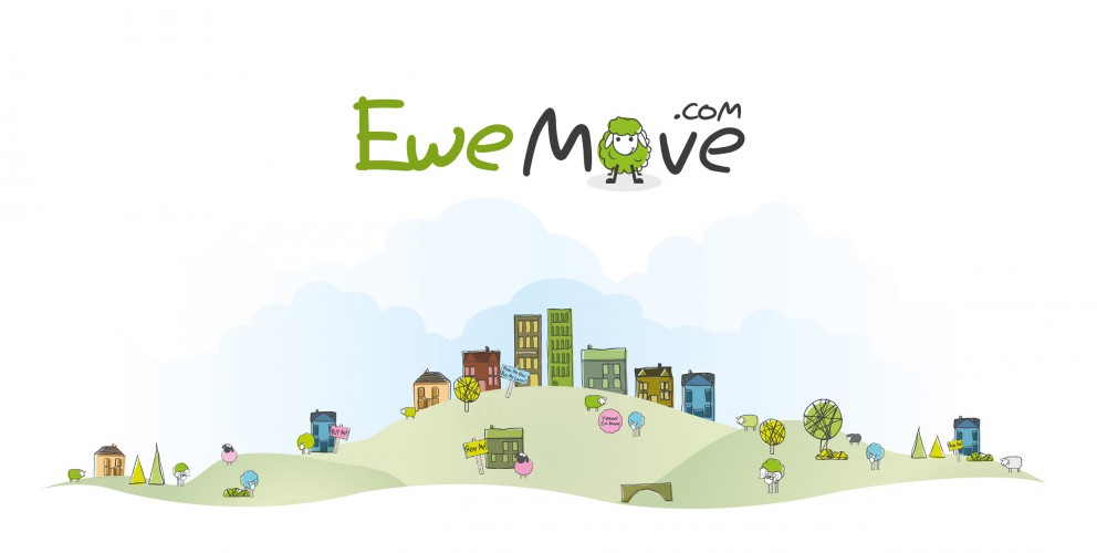
When the UK's most innovative property group needed a new website design they naturally first viewed then moved to 22. Having re-branded themselves as EweMove with a distinctive 'sheep' logo they wanted a website that was as cool and witty. We not only gave them a strongly branded fresh 'natural' look (miles away from the traditional, cluttered 'letting agent' style) but we also 'branded' the language. So, 'Ewe could could find a property that was best of breed', 'their service was ewe-nique' and 'they were the best property group - baa none' Robin Arnold, Creative Director of 22 says,"EweMove have been great partners in encouraging us to create a website that's as distinctive and innovative as they are and we're now repeating this style in their promotional literature. They've been baa-rilliant"(see it's catching)
Check the site out www.ewemove.com
