23/02/2013

22 revive Key youth charity brand and website

We are chuffed to bits to announce the launch of the Key youth charity branding and website! Thanks to the team for all of their hard work and thanks to Key for being such a cool client.

We were asked to reinvigorate and refresh the look and feel for the youth charity Key. Their tired brand identity and website didn’t fully represent them as a charity aimed at young people.

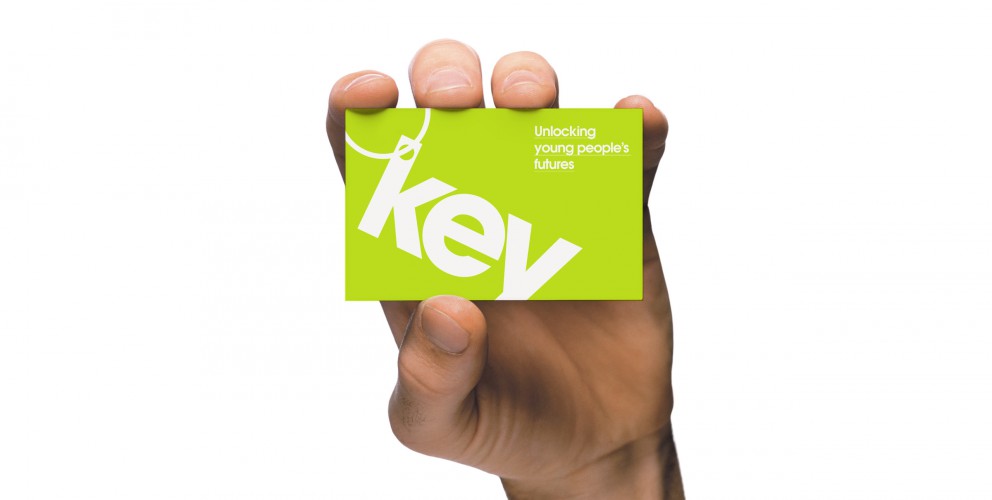
Key is an amazing charity that provides housing support to young people up to the age of 25. Offering a variety of services including mediation, support, mentoring and counselling, it was imperative that their target audience could instantly connect with the brand; moreover to actively encourage them to get in touch and not immediately dismiss Key because of their outdated design.

Director of Key, Ursula Patten had a clear vision for the brand: “Key decided to update its identity as although our black and white Key was well designed and had been used for a long time, a number of young people had commented that it was boring and austere."

“We were looking for something to reflect that we are young person focused. We wanted something more colourful and more vibrant. We were delighted with the new logo - it was bright and simple - we felt that it wouldn’t date. This was the starting point for the redesign of the website. The old website was very static and one dimensional and again didn’t reflect Key’s ethos.”

Through clever use of typography we created a modern and engaging logo with subtle reference to the shape of a ‘Key’. The bright colour pallette, angular typography and photos of service users created a distinctive and memorable look that genuinely conveys Key’s message.

Key’s core requirements for the site were to appeal and convey vital information to young people who need help, and to also shout about the great work it is doing in order to fundraise and attract volunteers. These were also fulfilled by developing two clear routes through the site by using compelling graphic design.

Patten and the board of trustees were delighted with the end result and our collaborative approach: “We chose 22 as a number of our trustees had seen previous examples of their work. We were impressed by their professionalism. It helped that the staff put in the time to work with the board of trustees and took them through a number of design options and the thoughts behind them."

“The website design element felt like a two way process with Key’s thoughts and ideas fully incorporated. It is no easy task to build a website that will please all those involved, but 22 have been patient in ensuring that this happens. We are extremely pleased with the result. It doesn’t just look like any other website. It is bright and engaging.”

It was great to work with a charity that gives so much back to the youth community of today, it made this project so much more meaningful. It’s a privilege that our designs and strategic positioning of the brand will help young people to get the assistance that they need.

23/02/2013

The cream of superlogos

This months Superlogo is one of my personal top 5 favourite logos of all time. It was the marque that epitomised the crème de la crème of superclub branding in the 90's, the world famous spinning propeller — The Cream nightclub logo.

It may not have the historical baggage of some of the logo superheavy weights, but when it comes to elegance and form it is up there with the best of them.

20 years after it's inception the logo itself still looks as fresh and ultra modern as ever. In fact I would go as far as to say that I can't see this marque dating any time soon. The typeface maybe — but not a beautifully simple shape such as this. This is another example that simplicity tends to equal longevity when it comes to logo design.

If you don't already know, "Cream was the club that turned a dusty warehouse into the country's most popular dance-floor, that got people to queue through Liverpool's streets hour after hour and inspired students to apply to the city's universities in their droves. Cream then staged its first event in Ibiza in 1994 and continues to host one of the biggest club nights on the island at Amnesia, and has become the longest running UK Club night to stage events on the party isle. With Ibiza's cosmopolitan crowd the Cream story soon began to spread around the world and the company was soon organising events in places as varied as Buenos Aires to Moscow. The company now stages over 100 events annually and its international activity has gone on to become one of the company’s greatest achievements." Emma Johnson

It has booked stars like Kylie Minogue, made household names out of men who played other people's records and the lovely logo is recognised the world over.

The creative genius behind the Cream logo and branding was Rob Petrie. Here is a fascinating quote from the man himself:

"In 1993 I was a designer at Farrow when we were commissioned by Darren Hughes and James Barton the founders of Cream to design a logo for them. The brief was pretty loose but I remember Darren saying something like making it look ' classic like the Nike logo'. The early logo ideas were very much coming from the influence of Japanese car manufacturers logos - Toyota and Mitsubishi, where the logo is constructed of three interlocking elements that create the unified whole. As I then started using drop shapes referencing the actual name I was also trying to create something that was more organic yet had a subtle timeless strength to it, the Yin Yang symbol being an unlikely inspiration. When the final logo design revealed itself it was pretty obvious it was going to be the one that was chosen.

After featuring it on full page ads in pages of The Face, Ministry and Mixmag magazines it then featured on it's first CD sleeve 'Cream Live' - which was produced in five different colours of rubber. At this point I saw what was for me the most memorable incarnation of it as a 10cm high tattoo on a sweaty clubber on the dancefloor at Cream. Not sure how he'll explain that one to the grand kids.

In 1995 myself and fellow designer Phil Sims set up Dolphin Design as Mark (Farrow) left to form Farrow Design as we now know it. We continued with the Cream ads giving life to the logo and showing it's versatility by having it photographed made out of chrome, made into a snow dome, made of flowers, made into a leather chair etc. Around about this time we were quite often approached with the brief of 'can you give us something like the Cream logo you did?'

We also started creating the ads and sleeves for Renaissance nightclub, a competitor to Cream, featuring a whole range of natural objects - eggs, butterflies, flowers and leaves. Probably the most memorable campaign was the sleeves and posters was for The Mix Collection 4 which featured 3 different coloured leaves." Rob Petrie

The beauty of such a simple but distinctive marque is that it is extremely versatile. So versatile in fact, Cream have used the logo in one form or another in most of their marketing materials for the last 20 years. The logo has metamorphosed from leather chairs, to futuristic 3D graphics. From tattoos to teeth braces. In whatever guise it appears the marque is always instantly recognisable.

As you may have gathered I was bang into dance music and often frequented Cream back in its hey day in the mid 90's. So for a design student into the scene, the Cream branding and in particular the legendary Cream and Renaissance flyers were a huge inspiration for me and helped to mould my own design style.

Robin Arnold — Creative director

10/01/2013

Superlogos

Over the next few months we are going to be listing our top 10 favourite logos of all time.

We are starting with an absolute corker, the one and only British Rail logo. OK, this maybe not be the sexiest marque you have ever seen but it has the stats of an absolute Top Trump.

When it comes to longevity it gives Cliff Richard a run for his money. It just keeps on going and going...in fact the logo, first commissioned in 1965, is still being used in 2013! Long after the demise of British Rail the marque is now used on traffic signs throughout the United Kingdom.

"In 1964 the Design Research Unit—Britain's first multi-disciplinary design agency founded in 1943 by Misha Black, Milner Gray and Herbert Read—was commissioned to breathe new life into the nation's neglected railway industry, the corporate image of which had remained largely unchanged after its nationalisation in 1948, a reflection of a largely disjointed and out-of-date transport system. The company name was shortened to British Rail and Gerry Barney of the Design Rearch Unit conceived the famous 'double-arrow which represents two tracks, heading in different directions, and crossed by stylised points." - Nick Jobs

There certainly aren't many logos out there that have lasted longer than the company they were originally created for! Here are some great articles about the history and application of this branding gemstone.

http://www.doublearrow.co.uk/

http://www.guardian.co.uk/artanddesign/artblog/2006/dec/12/everydesignthebritishrail

19/12/2012

Flying retro

As some of you may or may not already know we have a bit of penchant for retro design. The standard of typography, and photography on some of our favourite 60's / 70's poster designs is in a class of its own. Their purest simplicity makes them timeless masterpieces that look contemporary 40 years after they were crafted.

Whether or not you are fan of Swiss typography and well structured grids, you can't deny this is why the posters look so fresh and modern in 2012.

Some of our favourites include Ivan Chermayeff’s beautiful but uncompromising, Modernist Pan Am Airlines adverts. Here is a great article about the story behind them. http://bit.ly/Tyk5tt

And the incredible design legacy left behind by Otl Aicher's identity system, iconic posters and highly influential imagery for the 1972 Munich Olympics. http://bit.ly/U8fr6w  http://bit.ly/Tyk5tt

I only wish the legacy had reached a little further and touched the orchestrators of the London 2012 Olympic identity. But don't get me started me started on that! That's another story... if only Otl had been on the case in 2012!

And last but certainly not least, the master of all grids, Josef Müller-Brockmann http://bit.ly/V6v4ML

He is perhaps the most well-known Swiss designer and his name is probably the most easily recognized when talking about the period. His incredible obsession with grid systems goes to the point where he includes in his book aptly named the 'Grid System' a grid layout for arranging furniture within a room. http://bit.ly/Tyq4OU

Mr Muller, we will definitely keep this grid in mind for the new 22HQ layout!

17/12/2012

5 great apps for online collaboration

The web is packed with useful apps to help businesses these days and at 22 we love to make the most of them.

The mighty Google have created an integrated app suite which makes collaboration and getting common business tasks done super easy, so we thought we should share them with those who haven’t heard of them or not tried them before.

Google Docs

Imagine you have a team of people which need to have access to the same documents and make changes in real time to those documents. Well, Google Docs allows you to do just that. We found it particularly useful when collaborating on the writing of our business plan.

Learn more

Google Calendar

An essential part of any business, a calendar should enable you to keep track of tasks that need to be carried out, upcoming events and who is involved. Google Calendar performs these tasks brilliantly by making the setting of tasks, events and reminders really really simple. As with all Google apps, colleagues can be given the power to make changes or view the calender independently and create their own calendars which can then be integrated with the main company calendar. We’ve set our browser homepages to the Google Calendar so we are easily reminded of the tasks and events ahead.

Learn more

Google Drive

Google Drive enables a team to share assets online via an web based interface and also an offline desktop application which updates when the online drive is updated. This means that wherever you go you can have all of your useful digital assets at your fingertips. We find it particularly useful for storing our company documents and website project assets.

Learn more

Google Sheets

Google Sheets as the name suggests, is a web based and feature rich spreadsheet application. It’s really handy for keeping accounting information, keeping track of important lists, calculating quotes and even supports advanced charts and formulas. We use it for creating in-house statistics and quick project quotes.

Learn more

Google Slides

Slides is Googles answer to web based presentations, it supports embedded videos, animations, dynamic slide transitions and even allows you to publish presentations on the web. We’ve found it really useful for working together to create presentations for clients and for demonstrating our in-house ideas and strategies for business development.

Learn more

So there we have 5 great apps for business collaboration online, it doesn’t stop there though, there are tonnes more apps out there, so be sure to check them out!

21/11/2012

Mangajo packaging design

22 have been working with healthy drinks brand Mangajo on the packaging for their new 330ml range of drinks. We have designed the labels for the Lemon and Green Tea, Red Grape & Rooibos, and Pomegranate & Green Tea bottles.

Using the lovely brand petal as a device to contain the details and introducing a fresh new colour scheme, we have created a look and feel that is as fresh fruity as the drinks – and the Mangajo brand for that matter.

Mangajo have many UK independent stockists and are sold in well known stores such as
www.waitrose.co.uk
www.wholefoods.com
www.yosushi.com
www.flatplanet.co.uk
www.Harrods.com
www.selfridges.co.uk
www.budgens.co.uk
as well as over 20 countries around the world. Whether you are in Manchester or Malta, Greece or Guadeloupe look out for this bevvy of natural beauties on a shelf near you!

16/09/2012

Mangajo website

We’ve worked with this super fun and funky global brand for 3 years. In that time, we’ve worked on a number of projects, and most recently – was asked to redesign and redevelop their website.

MangaJo sell Healthy drinks in over a 20 countries, so the new website had to appeal to an ever growing user base. They wanted an uber cool, fun, and funky website that was informative, easy to use, and update.

We created a feel good website that looks and feels as fresh and funky as the MangaJo brand. We kept it minimal, utilising great product photography, cool illustrations and most of all made it fun. The site was built with a system that enabled the client to update any page, quickly and easily.

Needless to say, we were chuffed to bits with great feedback received so far, and the fantastic responses from the many visitors on the website.

27/08/2012

The Reward Practice website

The Reward Practice are an independent source of advice on how to reward, incentivise and motivate staff. As part of our branding development for the Reward Practice we were asked to do a complete redesign and development of their existing website.

We started from scratch with this project. The existing site just wasn't doing it's job and the new site had to contain considerably more information. The task for us was how to keep the clean minimalist look and feel of the new branding we had created whilst containing such a large amount of resource material.

Good use of grids and structured typography normally does the trick in these situations and it was perfect for this project. What initially looks like a lot of text, doesn’t look and feel as heavy and crowded. Also, the site could be used for information on the specialist subject of rewards and incentives. This has naturally attracted a more traffic to the site.

Overall, the new site has helped The Reward Practice reach out to a much larger audience and has helped them sell their product more effectively.

16/07/2012

Global Filmmakers pitch win

We've just been told we have won the three way creative pitch we took part in at the beginning of the month. The pitch was for the branding and website design and development of Global Filmmakers. One of the most comprehensive, efficient and most advanced video production packages available in the UK.

We cant wait to get started. Action!

22/05/2012

Manchester Digital Skills summit identity

The Manchester Digital Skills summit is a source of valuable information and guidance for anyone who needs access to digital talent and it’s the opportunity for the digital community to shape skills development across the region and keep the next generation of digital talent in Manchester.

We were asked to create a logo for the event and happily obliged with this cool typographic marque which includes the Manchester Digital logo.

This is a great event and we thoroughly recommend if your into digital, and live in the North West, you get yourself to the event.

Hopefully see you there.

13/05/2012

The Reward Practice brand identity

We are proud to announce the official launch of The The Reward Practice brand identity.

The Reward Practice are a totally independent source of advice on how to reward, incentivise and motivate staff as efficiently as possible. They asked us to make their brand appeal to their customer base (FTSE 100 organisations), feel professional, corporate and stand out from their competitors.

With a substantial proportion company revenues being spent on paying and motivating employees, organisations need to ensure that every single payroll Dollar, Euro or Pound is wisely spent.

The experience of our friends at The Reward Practice shows that it is entirely possible to reduce overall payroll spend and improve the pay and incentives available to high performers in mission-critical jobs.

The saying ‘Earning the Fruits of your labour’ inspired the branding concept. The feel we got from this was Rewarding, Hard work and Organic. With these words in mind we created eye-catching graphics – inspired by fruit, contemporary typography and a brand that looked confident, corporate but fresh and different enough to stand out of the crowd.

23/04/2012

Online estate agency advertising campaign

Here is the first glimpse of the new advertising campaign we have created for online estate agency Self-sale.com. The look and feel of the campaign uses the graphic illustrations we created back in February as part of the brand refresh.

This is the first bill board advert to be designed and we are over the moon with the positive feedback we have received so far.

Manchester

0333 242 0647
enquiries@22group.co.uk

26 Dale Street, Manchester, M1 1FY
Find us on Google Maps

Our partners

22 Group is the umbrella company for creative work. Check out our specialised branches for work in the property and finance sectors: Property Stream | Finance Stream


Copyright © 22 Group Ltd. 2025. All rights reserved.